Experiment With Style Transfer
Dr. Bryan Patrick Wood
May 29, 2020
Filed under “DS/AI/ML”
What is style transfer? Style transfer is a machine learning technique to transfer the style of one datum onto another. Truth in advertising this time. I will be looking at image style transfer specifically. The techniques is a few years old now. I can remember when I first saw the paper's results I thought ... magic!
The process used below follows the seminal paper Image Style Transfer Using Convolutional Neural Networks which uses the pre-trained VGG19 Imagenet model. The PyTorch implementation was taken liberally from the Style Transfer section of the Udacity Deep Learning Nanodegree Program. I had planned to go into more detail about the paper and implementation approach but this post is already long enough just with the results so that will be deferred to a possible future post.
I used a fixed picture for the content image throughout and varied the style image.
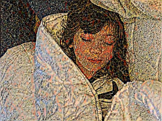
I chose a picture of my eldest daughter sleeping for the content image: tell me
that's not the picture of an angel ensconced in a cloud-like comforter?
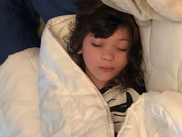
All appreciation in advance for not making her the transfer learning Lenna!1
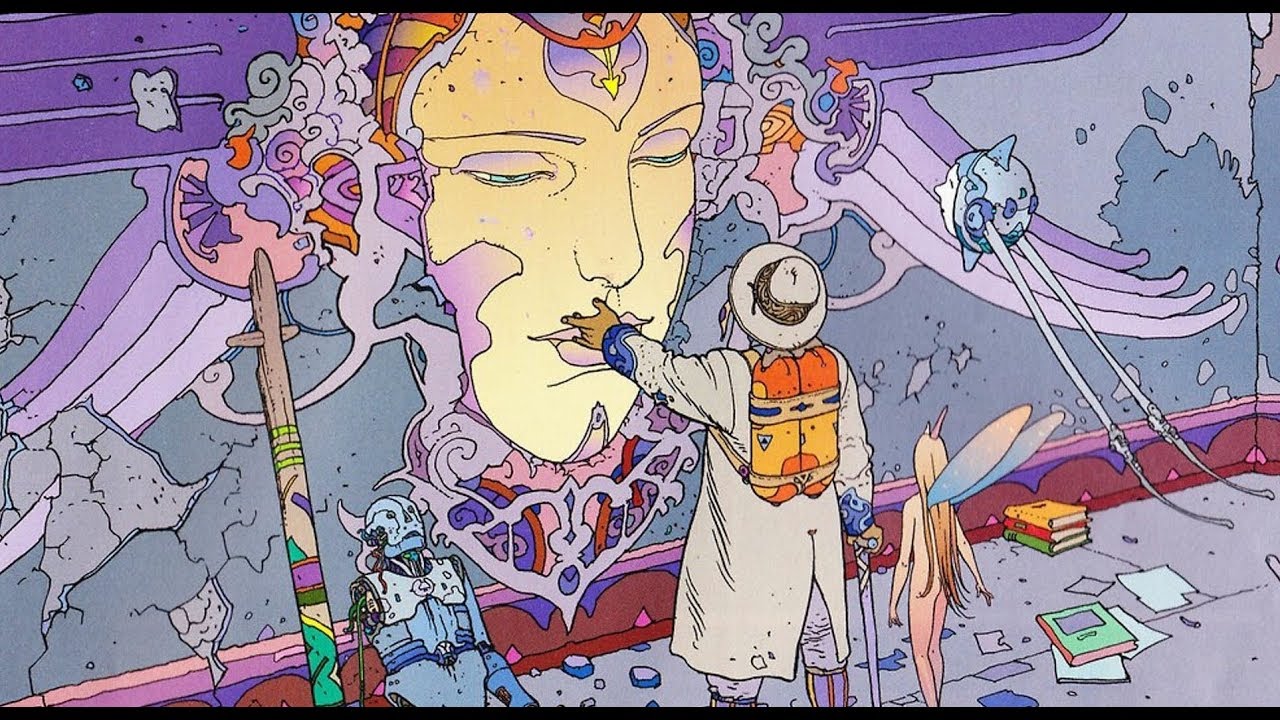
Jean Henri Gaston Giraud was a French artist that achieved great acclaim under the Mœbius pseudonym. The first two examples are from the fantastic and surreal comic artist Mœbius.
The first example came out pretty well and trippy: a lot like his originals. The
vibrant shades of purple really pop.
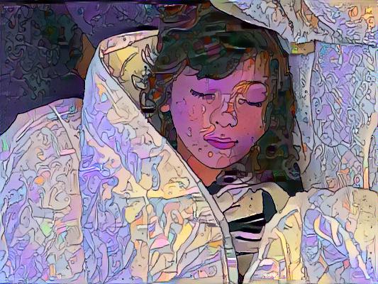
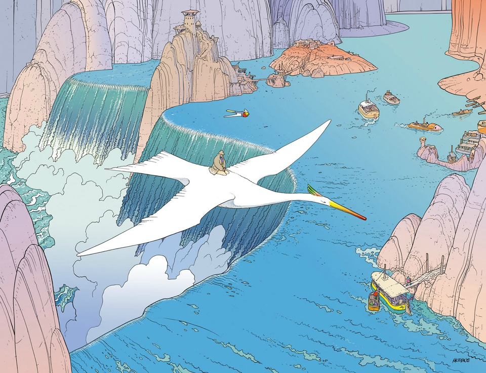
 First one from Moebius. This is one of a series of fantasy prints from a
collection called Mystere of Montrouge (this one is plate 10).2
First one from Moebius. This is one of a series of fantasy prints from a
collection called Mystere of Montrouge (this one is plate 10).2
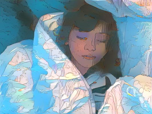
A second example by the same artist; again, pretty good and trippy. Arguably a
better result as the comforter looks like a natural fit for transferring the
mountains and waterfalls to the content image.
 Another by Moebius. This one was done for the famous brand Hermès, who was
releasing a new perfume and asked him if he could do some artwork on the theme
of Hermès Voyages.3
Another by Moebius. This one was done for the famous brand Hermès, who was
releasing a new perfume and asked him if he could do some artwork on the theme
of Hermès Voyages.3
I think there were a couple different aspects that made these style images work particularly well with the content image. First, the style image used bright, vibrant colors: as we will see further on, style images dominated with darker colors produced worse results. Second, since the style image was an illustration with very precise underlying line art the subsequent transfer of style seemed to be more intricate as well. Most of the style images below that are dominated by larger blobs of color (e.g., Rothko) did produce as pleasing a result.
The next two use the style from two pieces by Piet Mondrain. Pieter Cornelis Mondriaan was a Dutch painter who is regarded as one of the greatest artists of the 20th century.
Not so long ago I participated in an art class to make a fused glass creation
and this is what I came up with.
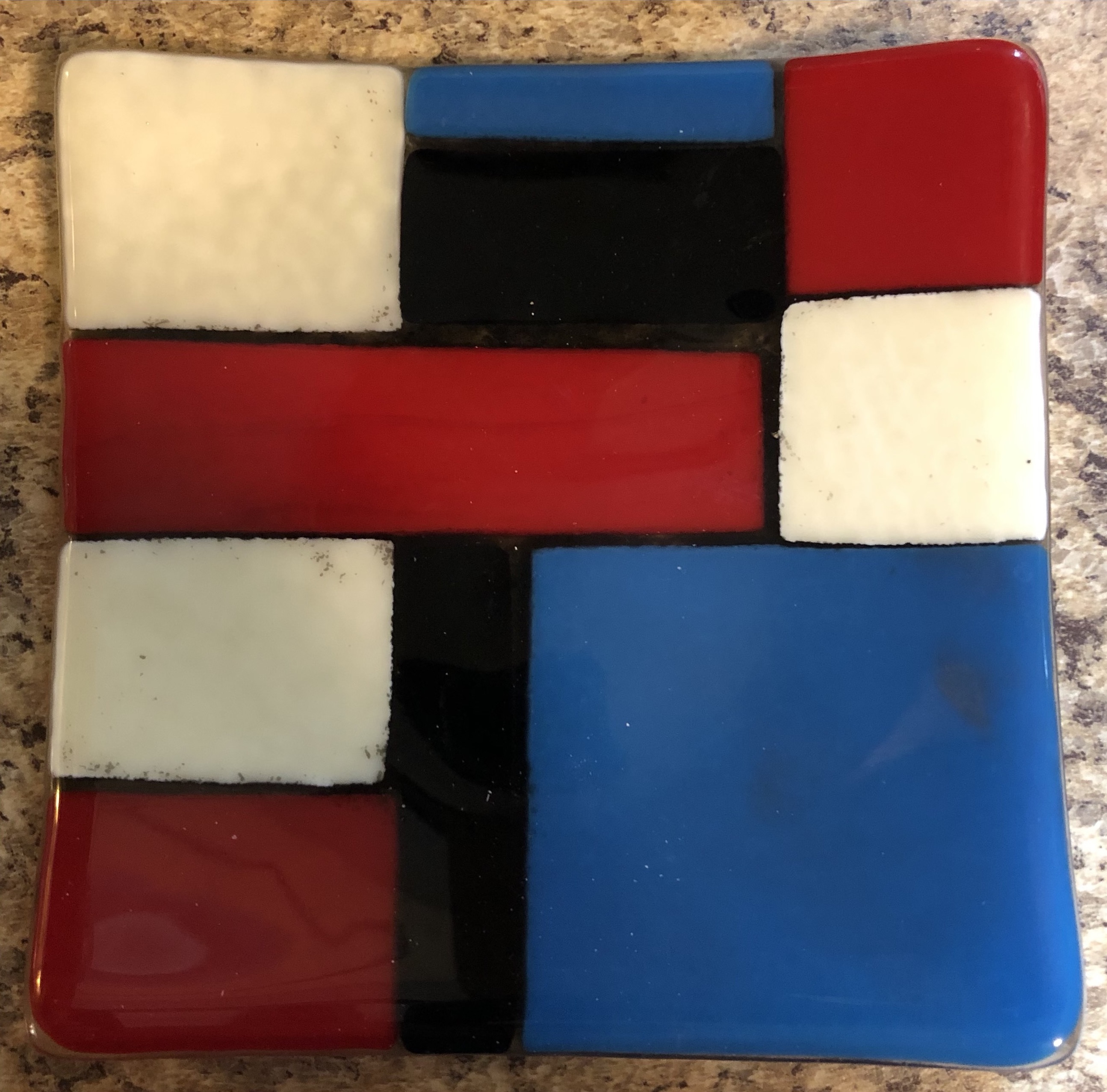
When the instructor came around and mentioned my creation was very Mondrain-esque poor confused me just smiled and nodded. I later found out what she meant and I have to agree it is quite uncanny.
The first one is a little busier than many of his other works but has a nice
aesthetic.
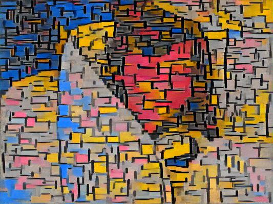
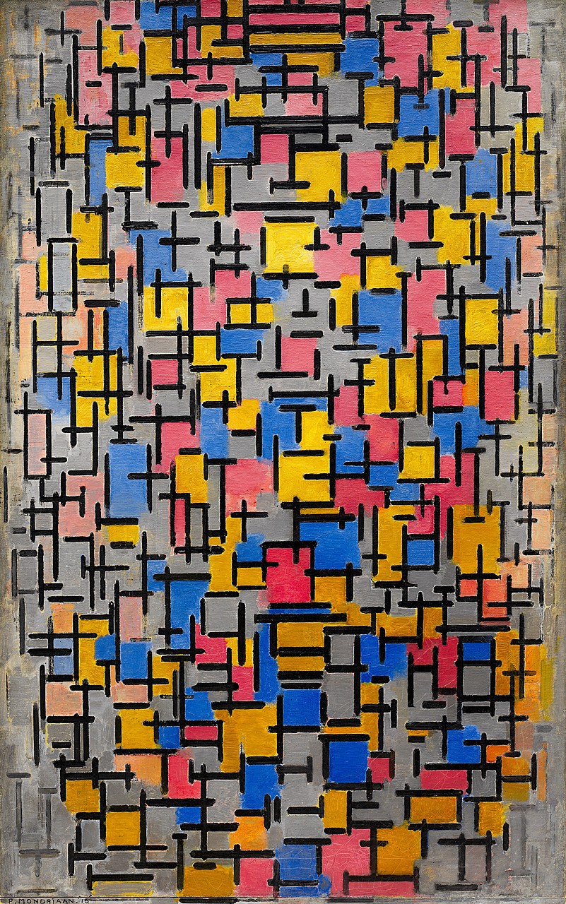
Tableau No. 2/Composition No. VII by Piet Mondrian.4
The second one is probably much more representative of what most folks think of
when they picture Mondrian's artwork.
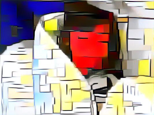
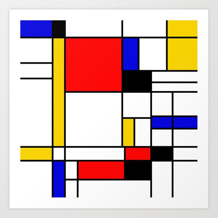 It looks like Mondrain made a ton of similar looking pieces under the
umbrella of Composition. I spent very little time looking for the one I
used here before giving up.
It looks like Mondrain made a ton of similar looking pieces under the
umbrella of Composition. I spent very little time looking for the one I
used here before giving up.
I actually was pleased with the results here although when I showed them to my wife she did not care for them. For these styles being being so abstract I was not sure what exactly to expect. In the two cases I think the first one was trained just about right whereas the second one might have had a better result if trained for less epochs.
Gustav Klimt was an Austrian symbolist painter.
Next up is a painting by Gustav Klimt of a flower garden that I thought would
produce a nice style effect.
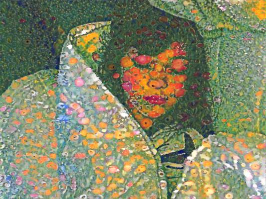
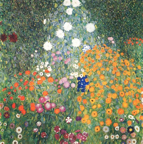
Blumengarten (Flower Garden) by Gustav Klimt.5
My wife did like this one and it is not that I dislike it as much as it almost looks to me like she has either boils or bad poison ivy on her face. To each their own on that one. It is not an altogether unpleasant effect. One thing to note is that the presence of all the circular flower patterns in the style image transfer fairly literally to the content image.
I know Jackson Pollock is viewed as a divisive figure in the art world but I have always enjoyed his work without thinking about whether a four year-old could produce the same effect given a canvas, buckets of random paint colors, and a couple brushes.
I thought his unique style might be a good fit for style transfer and I picked a
representative work to try out.
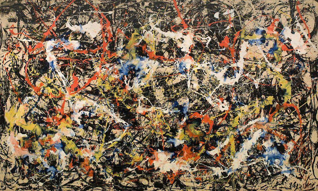 Nice looking painting called Convergence by Jackson Pollock.6
Was not terribly impressed with the results here. Maybe a different work or more training epochs could have improved the result.
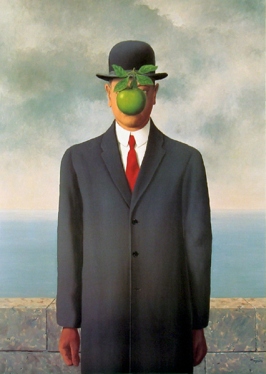
René François Ghislain Magritte was a Belgian Surrealist artist. My wife and I are both huge fan of René Magritte and his surrealist art. In our home we have two of his works up on the walls.
My wife is partial to his Le fils de l'homme (The Son of Man)7,
which is great, but I have always had a soft spot for the cerebral La trahison des images
(The Treachery of Images)8.
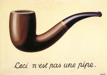 For those that are not already familiar.
I love this quote
When Magritte was once asked about La trahison des images, he replied that of course it was not a pipe, just try to fill it with tobacco.9
However, for style transfer I did not think either were particularly good
choices. I chose a work I was not very familiar with but was very stylized from
his earlier works
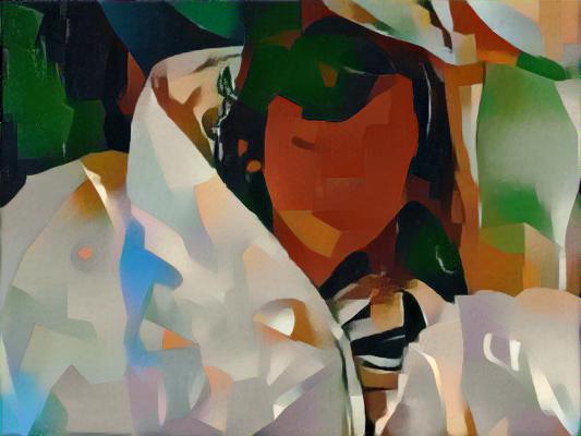
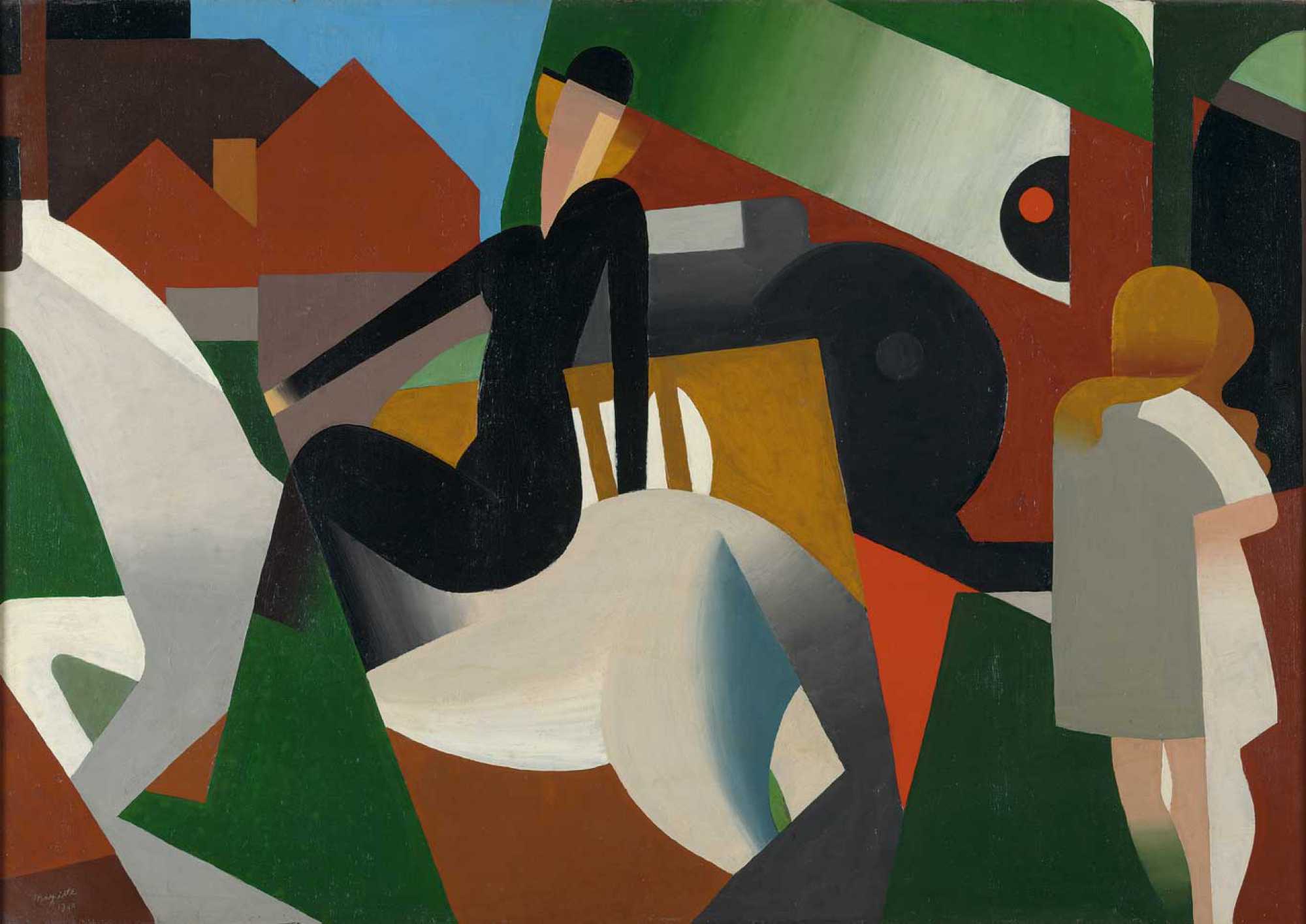 L’écuyère (Woman on horseback) by René Magritte. It was hard to find a good
citation for this one for some reason.
L’écuyère (Woman on horseback) by René Magritte. It was hard to find a good
citation for this one for some reason.
My assessment is an okay. The blocky colors in the style image led to a muddled transfer to the content. Not awful and maybe training for less epochs would have improved the situation but midland at best in comparison to the rest of the results.
Henri Émile Benoît Matisse was a French artist, known for both his use of color and his fluid and original style.
I am not a huge fan of Matisse in general but I was on the hunt for cool looking styles and I thought I had found one by him.
For this I chose what some consider his masterpiece
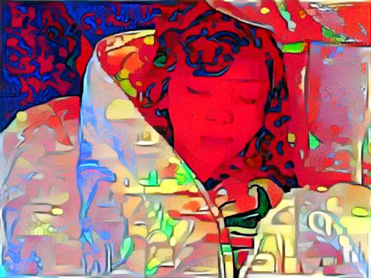
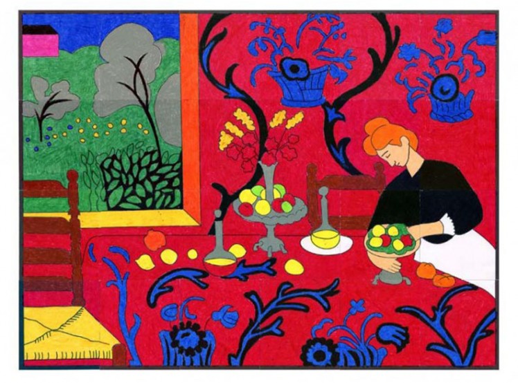 The Dessert: Harmony in Red (The Red Room) by Henri Matisse.10
For example, if I were going to spend more time to improve the result here I might try to apply an image filter to desaturate the style image. The red steamrolled the transfer, and I do not think there is much that could be done to fix this situation without modifying the style image itself.
Georgia Totto O'Keeffe was an American artist known for her paintings of enlarged flowers, New York skyscrapers, and New Mexico landscapes.
I know very little about Georgia O'Keeffe but I happened upon a couple of works of flowers that I thought might be good choices for style transfer.
This one was very pleasant with light color tones of whites and greens so based
on prior experience it seemed like a good bet
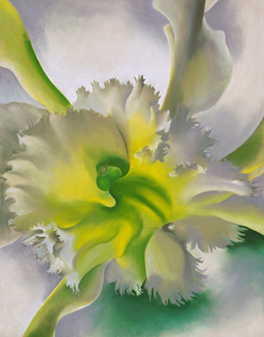 An Orchid by Georgia O'Keeffe.11
I like this one. It is not perfect, but it is pretty. Not sure if there's a way to just transfer the color information but that might have led to a better result in this case since the flower morphology does not add much when transferred to the aesthetic.
Mark Rothko was an American painter generally identified as an abstract expressionist.
Mark Rothko is another artist I have always found paintings somehow pleasing even if I could not articulate what exactly about the work it was that I liked. Another divisive art world figure I suppose.
Picked one I guessed would be good for style transfer.
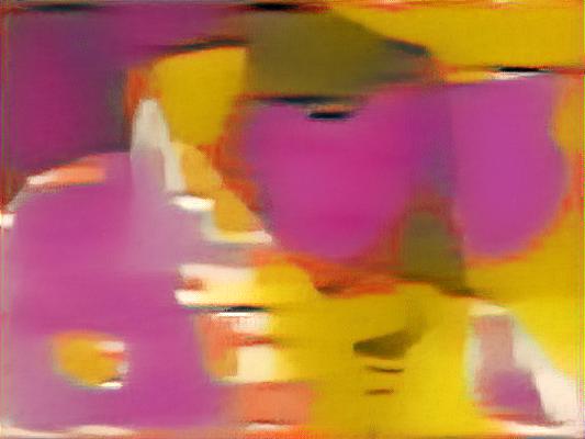
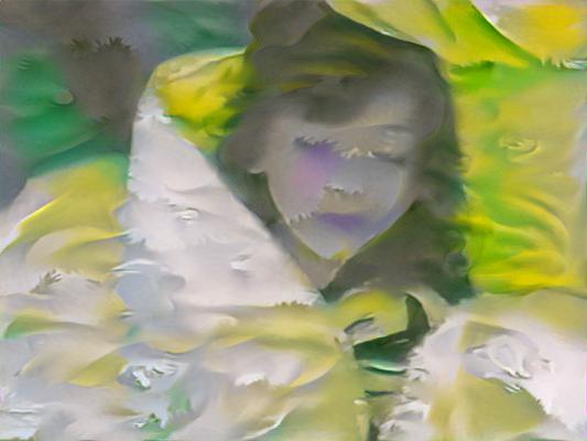
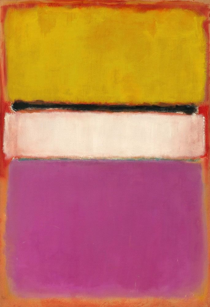 White Center (Yellow, Pink and Lavender on Rose) by Mark Rothko.12
The results were pretty bad but somewhat predictable in hindsight. Not sure this could be made to work much better given my newly found appreciation for what does and does not work well in the realm of image style transfer at least with the knob I know how to turn.
Far from leaving the best for last, is my final attempt at style transfer for this post.
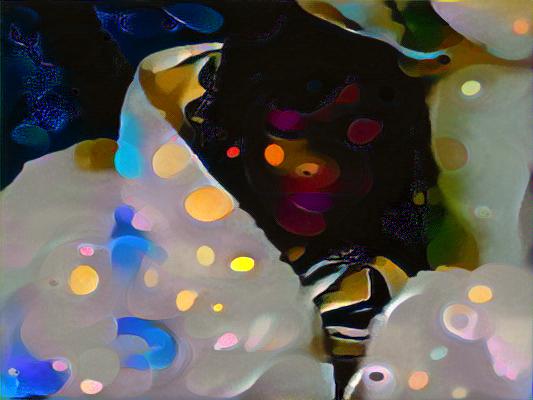
Wassily Wassilyevich Kandinsky was a Russian painter generally credited as the pioneer of abstract art.
This one from Kandinsky look promising at the time I was collecting style
images.
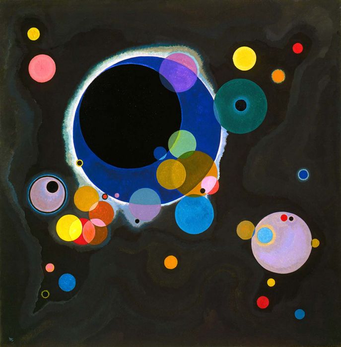 Several Circles by Wassily Kandinsky.13
The result is less than awesome although it has grown on me a little. Too much black in the style image or too many training epochs.
Perhaps tuning, lessons learned, or alternative models. I did collect many more style images during the exploration phase of writing this post so I may get around to writing a follow-up post at some point spending a little more time on aspects that were not discussed in any great detail. All in all, this was a pretty fun experiment with some cool output that I would not mind revisiting in the future.