Python Visualization Koans
Dr. Bryan Patrick Wood
August 28, 2022
Filed under “DS/AI/ML”
Too Long ...
Just looked. I have not published a new blog post all year so far: good work. I have been working on a couple different projects I intend to write blogs on. None have gotten to where I feel like they are ready for Still tinkering as usual. Fun stuff in the near future is coming. the writing to begin though.
So if nothing is ready why am I writing a blog post? Well, turns out I spotted another pretty little butterfly to chase and distract me from actually finishing the other projects I have in progress. In fairness, most of those other projects are longer-term and more involved than what I'll be writing about today. Nothing groundbreaking. May be of interest to folks trying to E.g., a proficiency listed on a resume: in this case data visualization using Python. hone their data science craft or looking for proof of competency.
Koans
I am no Zen Master. Although I continue to enjoy listening to quite a bit of Alan Watts on Audible. My understanding is that a koan is an inscrutable parable intended to free the mind from rational constructs needed to fully engage in Happy to be educated if that's way off base. many Zen Buddhist tradition's training rituals.
A few examples1 should clarify
What is the sound of one hand clapping?
When the many are reduced to one, to what is the one reduced?
What is the colour of wind?
Yep, clear as mud.
In the context of programming, the term has been co-opted to mean something like a puzzle to be solved often in the construct of TDD. Test Driven Development (TDD). This could be something like a sequence of tests presented to the student to create or modify a function or class so that it passes those tests one after another.
It's in this spirit that I created pyvizkoans. Specifically, I came across a
handsome chart published on the economist.com and wondered
The Economist's Graphic detail has a wealth of
inspiration to choose from. They also publish their design system2 which contains helpful details (e.g., fonts).
how difficult it would be to reproduce in Python. So I spun up Jupyterlab and went to work. Using matplotlib I got
pretty close, learned new tricks, and enjoyed the process.
I created a repository for this because I intend to make a habit of doing one such chart study every now and again. More often at work the focus is quick insights and not publication level aesthetics so it is a good thing to practice.
Numero Uno
So what do you think?
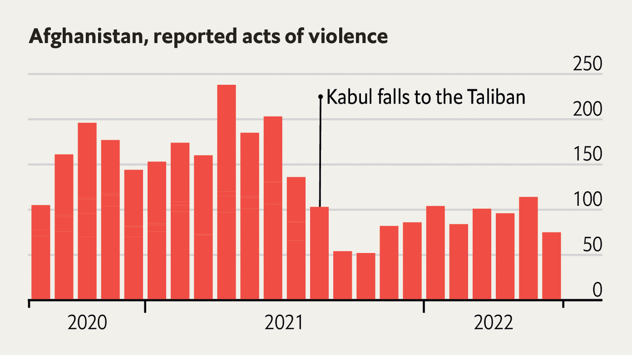
The Original
The Reproduction
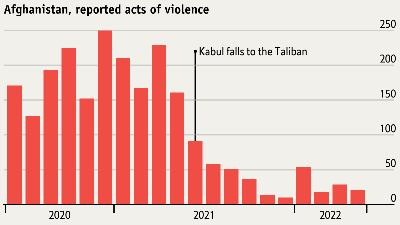
One thing that'll jump out is that no attempt to recreate the underlying data was made: the data was randomly generated in the spirit of the story the chart was trying to tell. The exercise was focused on the look and feel, not the data. There are a couple other issues I just gave up on trying to fix: additional details can be found in the notebook3. Even with all that said, I was not going for pixel perfect reproduction.
Closing Thoughts
Fun little exercise. I'd encourage others to try something like this themselves the next time you come across a graphic online with a distinctive or interesting aesthetic. Although I love the Economist's graph design aesthetic I'll probably find a different source for the next one since the goal is not to get good at reproducing Economist content. Varying the source most certainly will have more pedagogical value. If anyone reading this has other suggestions for particular charts or sources for charts I'd love to hear it: please leave a comment.